2021
Developing Data Patterns for HG Mercury Design System
By establishing data pattern guidelines we have been able to create consistency across the HG Mercury platform and reduce time to market, by leveraging reductions in design, development, and testing time.
COMPANY
Rivet Health
ROLE
Product Designer
PROBLEM & OPPORTUNITY
Reducing design and development time
In early 2020, Healthgrades acquired a marketing product suite that would become the HG Mercury Platform. The platform was mainly just an idea and needed to be designed and built within Salesforce and Tableau. I was tasked to be the designer for the Customer Relationship Management and Data Intelligence platform.
We quickly found that design and development time were being wasted on building data visualizations with inconsistent patterns across all our products, not just CRM and Data Intelligence.
The goal was to create a set of patterns and guidelines for the UX and Business Intelligence teams at Healthgrades to reduce design and development time.
APPROACH
How we were going to achieve it
We broke the project down into three different objectives that drove exploration, experimentation, solution and ultimately, successful adoption:
Color Palette: use HG Mercury Brand to make a WCAG 2.0 AA compliant palette
Chart Type: create a library of charts based on purpose of the data
Share and Adopt: share these guidelines and establish internal user adoption
Color Palette
The HG Mercury platform uses the Electric Blue as a primary accent within the light UI. We had an opportunity to use other colors in the design system to help elevate the Healthgrades brand within the products.
Using color effectively is one of the most important methods for creating useful visualizations. By conducting an audit of our dashboards, we found the need for the following color palette types: Categorical, Sequential, and Diverging.
HG Mercury Brand Palette
CATEGORICAL
Categorical colors aid users to distinguish non-numeric meaning to objects in a visualization. These are designed to be visually distinct from one another.
HG Mercury supports 5 categorical palettes
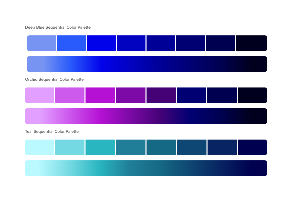
SEQUENTIAL
Sequential colors aid users to distinguish numeric meaning in a visualization. These are a gradation of colors that go from light to dark.
HG Mercury supports 3 sequential palettes
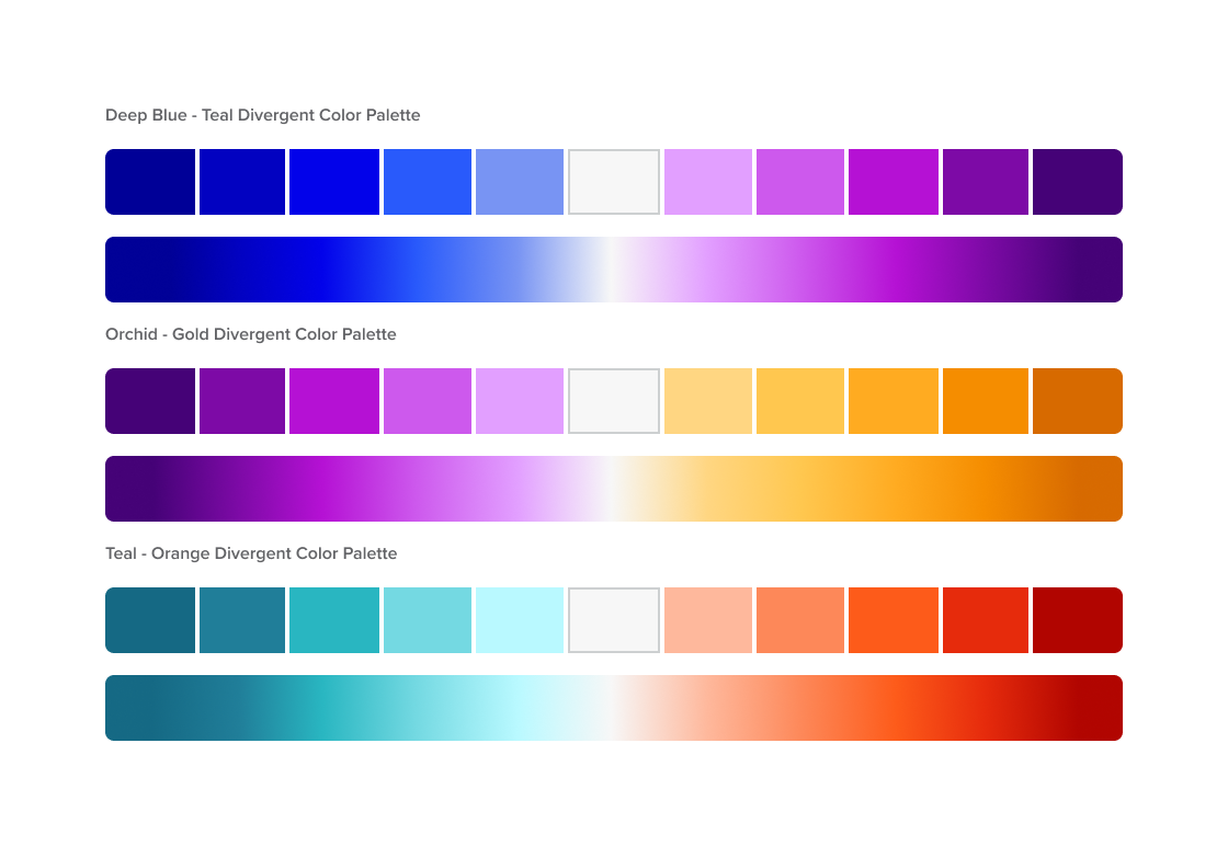
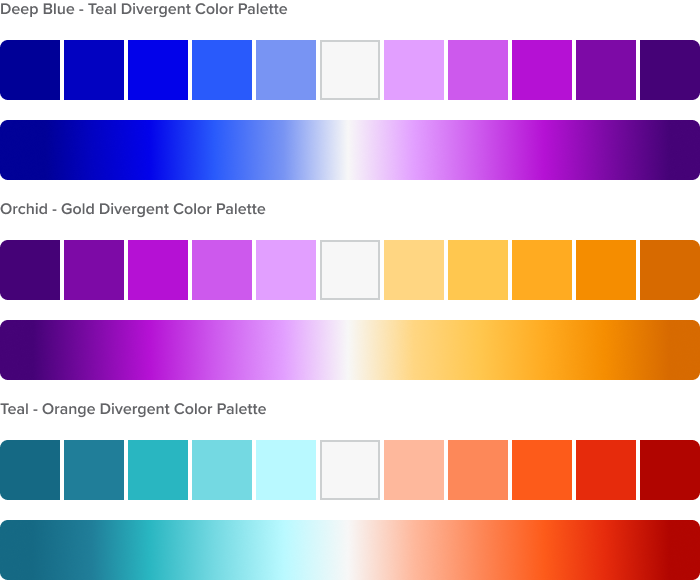
DIVERGENT
Divergent colors aid users to distinguish numeric meaning also. They’re useful when dealing with a range of two extreme with a baseline. (Ex. Negative to Positive Values)
HG Mercury supports 3 divergent palettes
Usage Guidelines
Use categorical colors sparingly
Use with non-numerical data and sparingly - instead of giving each item a color, provide it with another dimension.
These colors are best to distinguish between categories quickly, especially when paired with other charts for the same items.
Use up to 7 categorical colors
Although HG Mercury has a palette up to 12, best practice is to use no more than 7. Using more than 7 colors can make the visual overwhelming and unclear.
Be consistent across charts
Charts that use the same dimensions in a different view should use the same colors to be consistent to help the user see the relationship.
Use darker colors for larger numbers
Dark colors often represent larger density to the subconscious. Take for instance, a body of water: the more depth, the darker the water appears.
Accessibility
The HG Mercury Color palettes strives to be inclusive. We tested our color palette until we were able to achieve supporting individuals with color vision deficiency for red-green and yellow-blue as these are the most common types.
Below you will see how the color palette would look with the type of color vision deficiency. For a successful divergent colors, we needed to ensure that each hue spectrum had enough contrast.
No Visual Deficiency
Green-Red Deficiency
Yellow-Blue Deficiency
Chart Types
When selecting a chart type, it is important to understand the purpose of the data and how your users may want to view it. As the HG Mercury platform has multiple dashboards, we conducted an audit to create a helpful guide to picking a chart type based on user and business goals.
Explore the charts that we chose below:
Share and Adopt
Our guide was only valuable if adopted by users.
To ensure adoption, we needed buy-in from the Business Intelligence (BI) team. While they found our Data Visualization guide useful, they felt it didn’t streamline their workflow or reduce development time.
To address this, we created a .tps file containing all HG Mercury color palettes for Tableau, enabling developers to apply them to charts instantly.
Outcomes and Reflection
By creating the data visualization style guide, we have been able to on average decrease development time by 25% with the color reference file and patterns.
The design team has been able to streamline charts across our 6 dashboards that has created consistency across the products while promoting brand identity with the new HG Mercury Color Palette.


